
RHRP.
user flows, wireframes, visuals, and prototype.
Optum.
Spring 2026.
Lead Product Designer.
Figma, Figjam, Miro, Microsoft Copilot.
1 Product Designer (me), 2 front end react developers, 10 backend developers, 2 Project Managers, 1 Product Owner
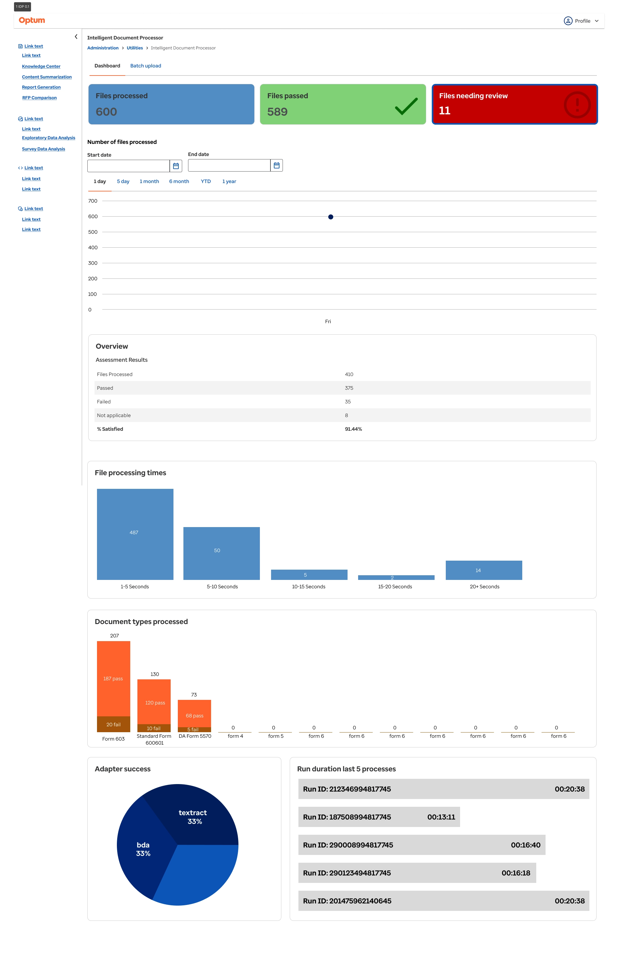
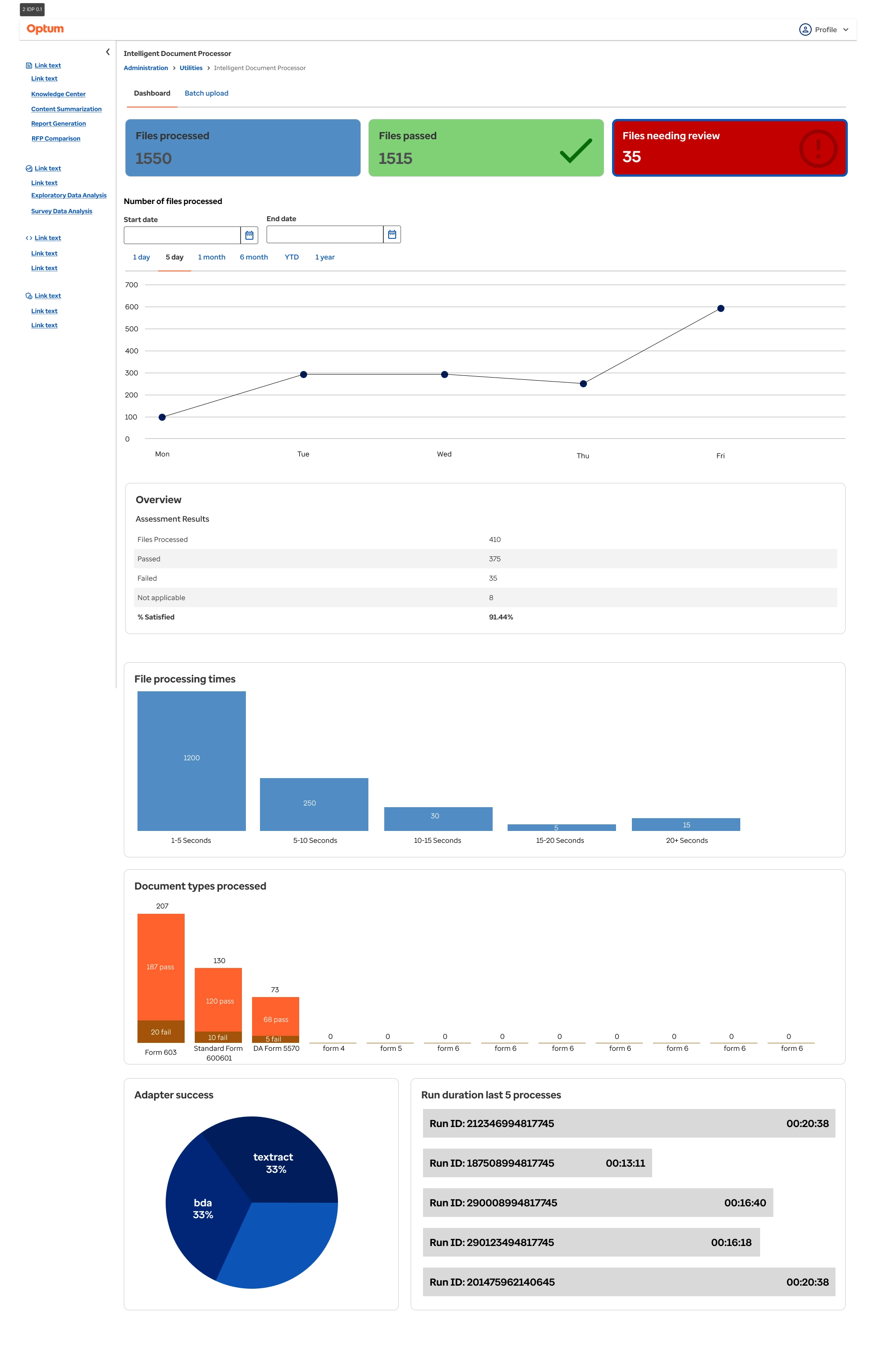
Optum had a document processor used for medical documents as part of a contract with the DoD. However it required manual upload and processing of the documents and the output did not tell the full story of where failures were happening. Most importantly however was that analysts had no way of seeing overall trends such as how many documents were being processed per day, how many were passing, how many were failing, the number of specific document types processed, or processing times. This were integral for users to build reports and to see how the system was functioning overall.
As part of a modernization effort to address user problems Optum needed to update their RHRP document processor. This was a project that was languishing for some time due to budget and staffing constraints. Partnering with the primary stakeholder, the Senior Director of Architecture, and the Senior Technical Project Manager to detail what their goals were for the project.
Conducting brief user interviews I began defining what current usability concerns were, eg manual process, no ability to export data, output was only in a table format, etc. It became very apparent that the system needed to be automated, users hated having to upload documents individually and had to sort the by the document type. This was very time consuming due to there being 20 different forms. It also became apparent that users weren't happy with the output. The ability to see which adapter (Textract, BDA, LLM) extracted what value and the confidence score associated was very important. When discussing what their workflow was like and how they were using the output it started to make sense that the users would want to be able to see values and trends over time. This would enable them to put together reports easier as well as understand where failures may be occurring.
From here I tackled the first major issue, the tabled output. Showing a minitable output when users would hover over a value they could easily see values extracted by which adapter and what the confidence the system had it was the correct value. I also implemented a flagging system where red flags would be presented if there was an error for the file and a green check if it passed. This way users would be able to identify quickly which files needed attention.
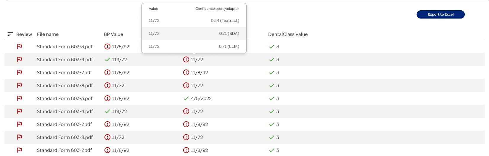
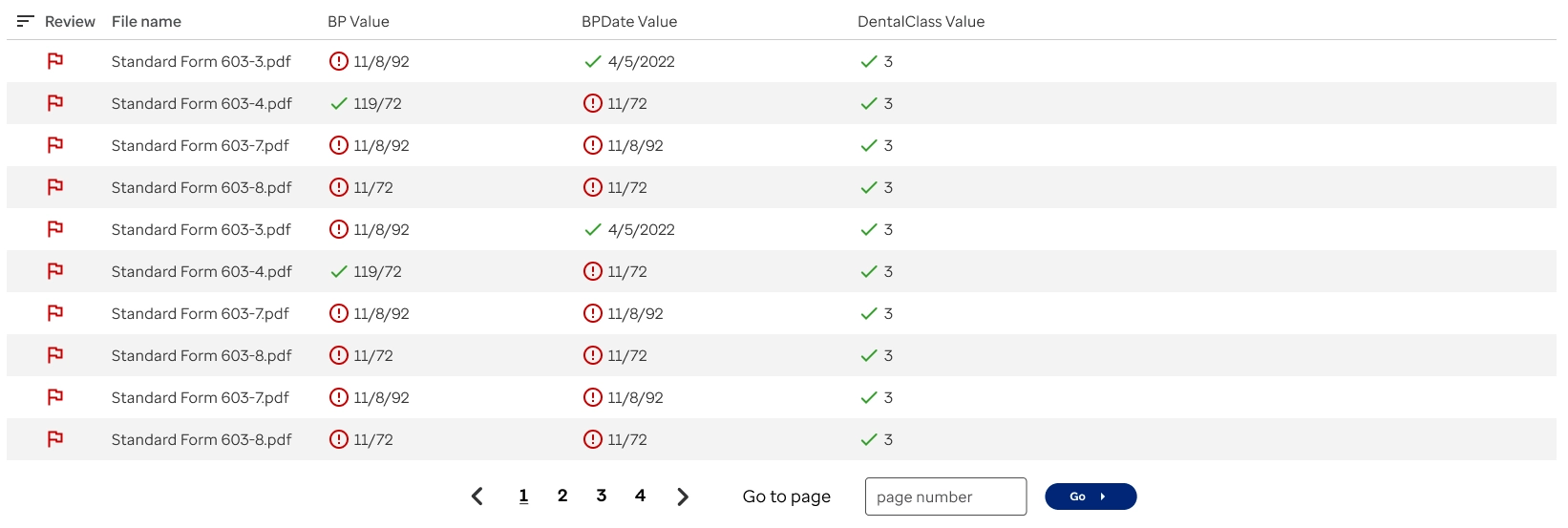
Throughout this process I was running design workshops with the development team and stakeholders so that we aligned on the solutions. Once the output was determined I moved on to building the wireframes for the dashboard. This took multiple design workshops to determine what would be useful for our end users. I was also utilizing Microsoft Copilot to determine any edge cases or potential things I may have missed as far as what visualizations could be beneficial to the end users.
With initial wireframes created, I used the existing Optum design system, Harmony, to develop the finalized visual designs.
"Tabled output isn't useful"
"Manual upload is clunky and slow"
"Users use the output to build reports. It would be useful to show a dashboard of metrics and data visualizations"
Working with stakeholders and subject matter experts at Optum through interviews and finding out integral pain points, I started rebuilding the existing table output to better show data values. We built this on React, and I leveraged an existing Optum design system, Harmony, that not only sped up development but we could keep a single source of truth while keeping the Optum branding. One key takeaway was that users are using this data to build reports, so being able to export the data would be useful. We also build a dashboard with data visualizations so they could get a bigger picture of how the system was working overall and be able to quickly report in real time.
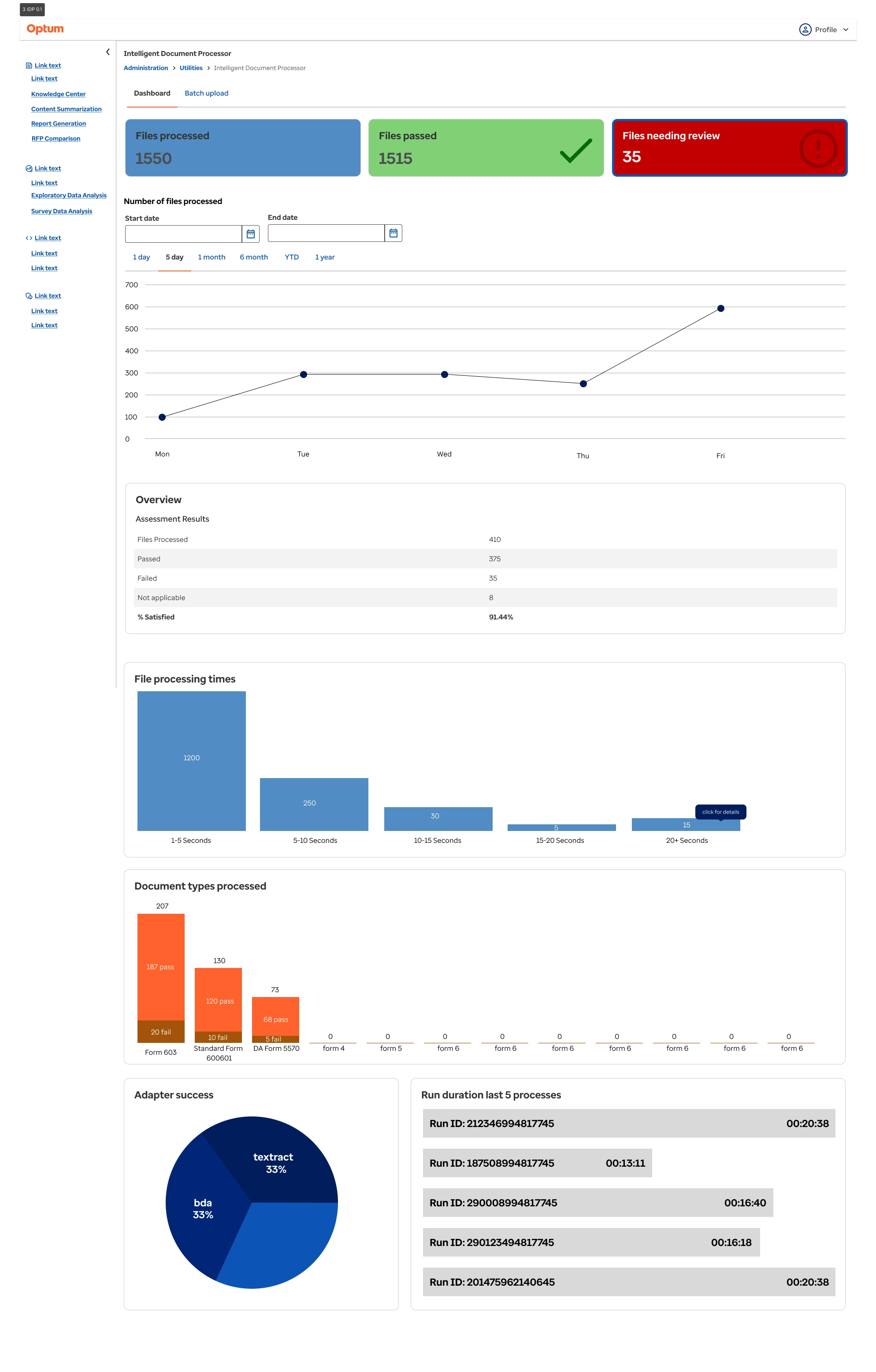
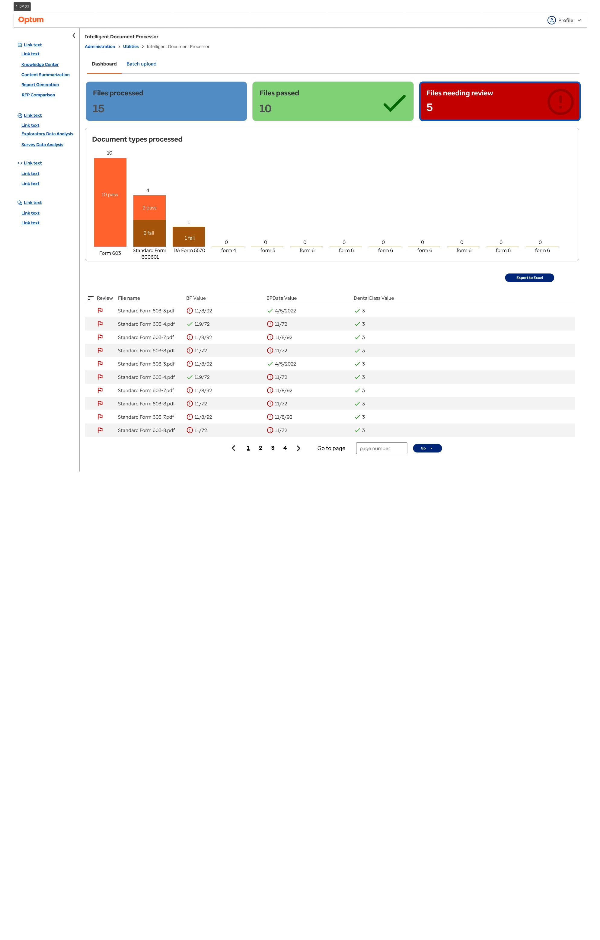
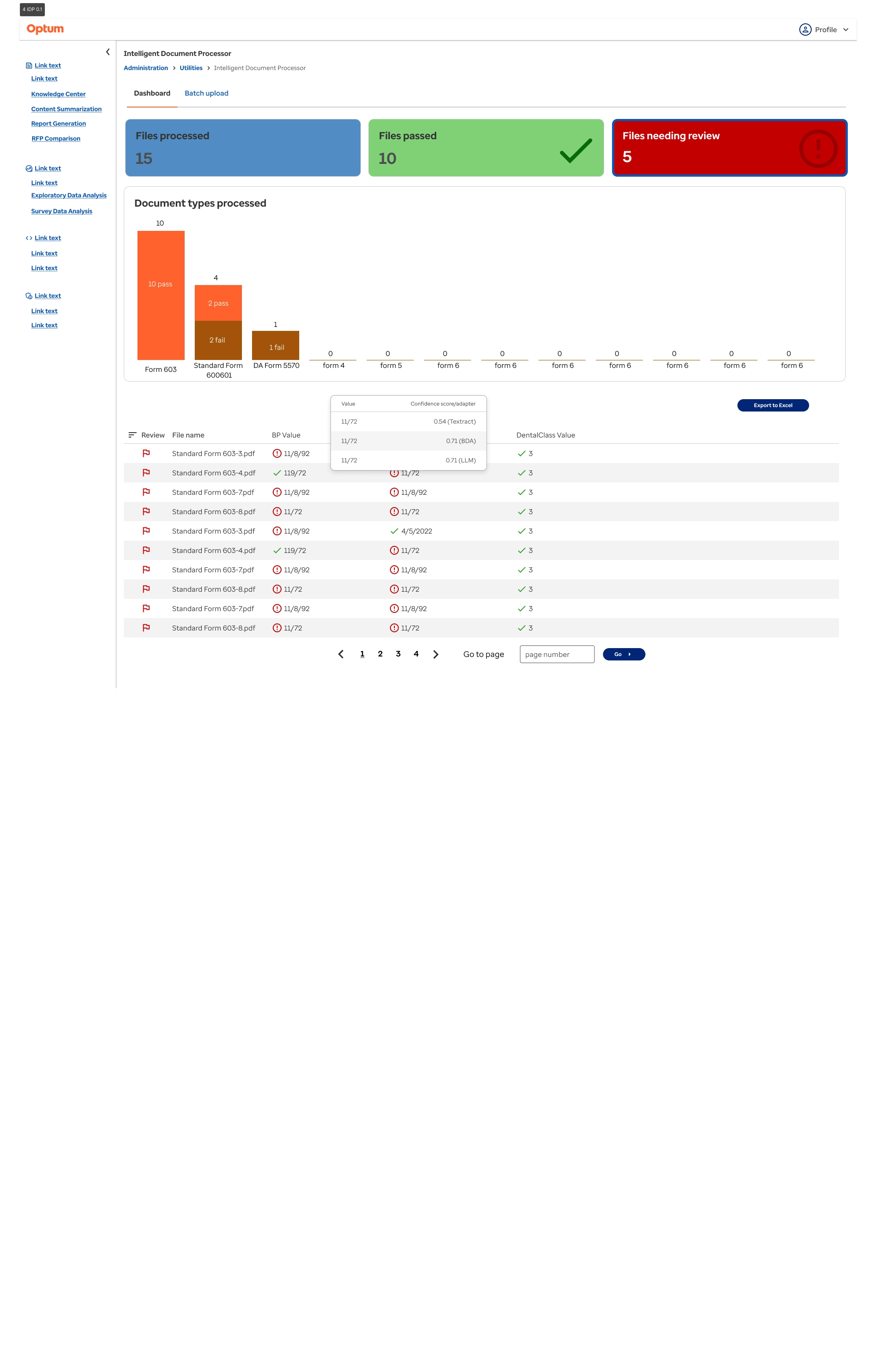
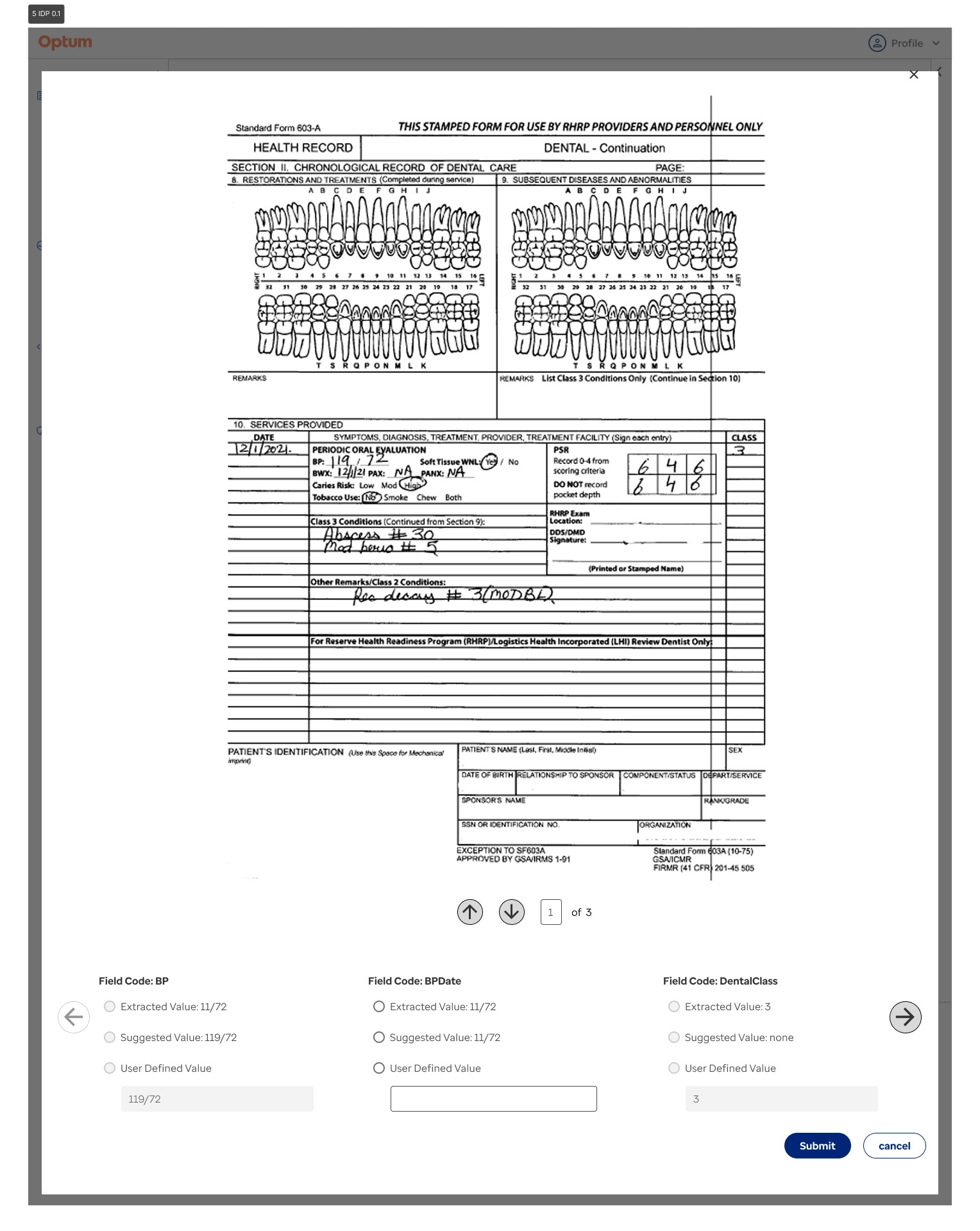
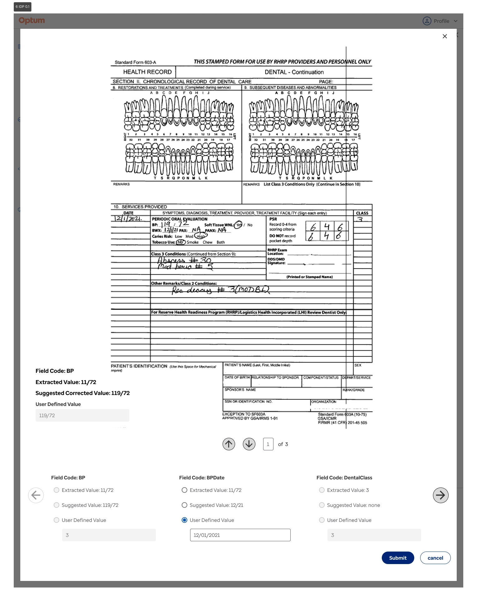
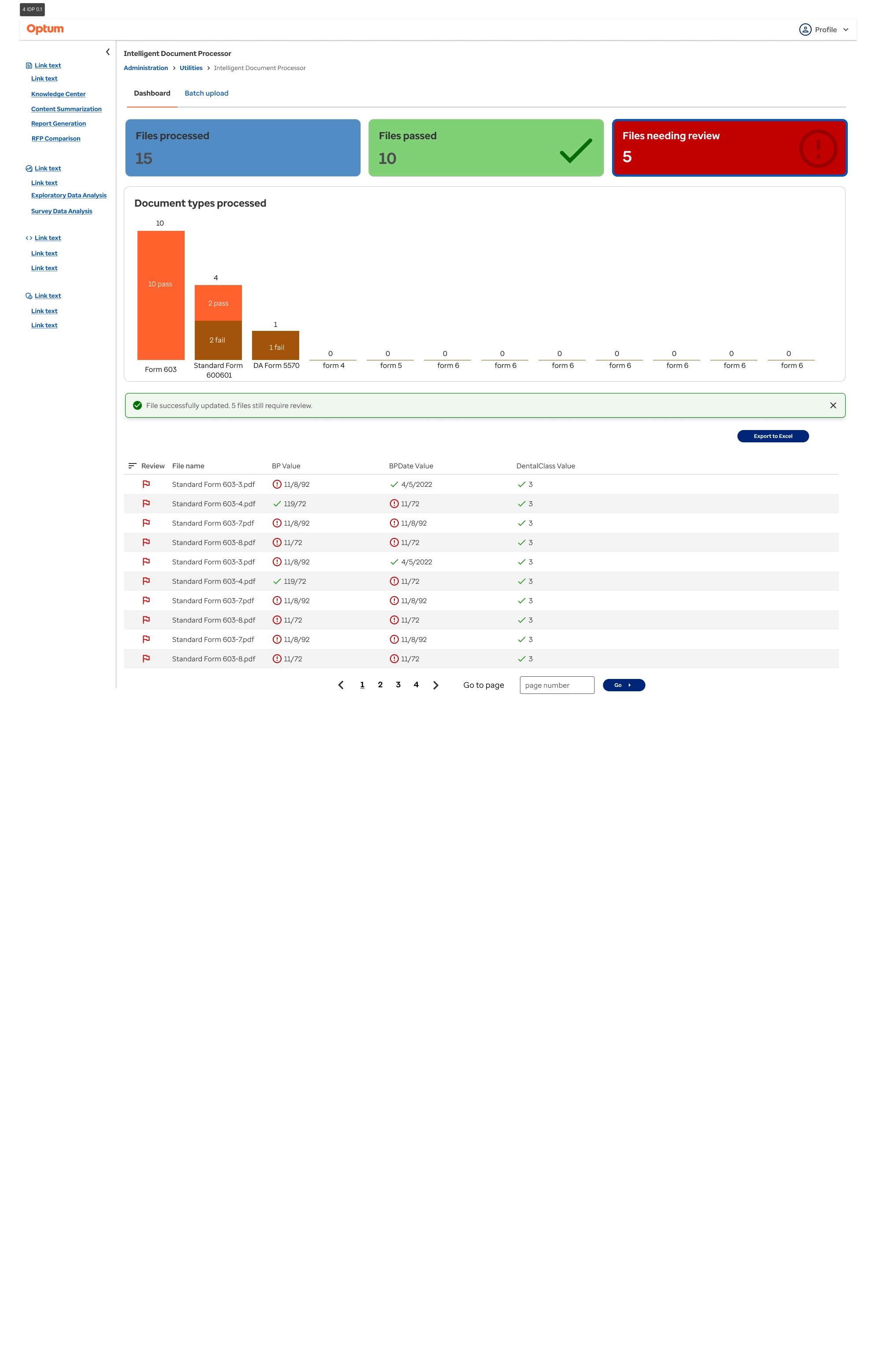
Leading multiple design workshops with engineering and stakeholders the initial wireframes proved very promising. We bagan light usability testing within these workshops when including several internal end users that we did the inital user interviews with. Building off of this full prototypes were built and then sent to production.
Trying to present lots of data at once presents many challenegs. At first with the tabular output I was showing multiple rows for each file. This proved incredibly clunky and took up too much screen real estate. Converting to the hover minitable helped to simplify this and show only essential information first. This type of progressive disclosure helped to reduce the cognitive load on the user.
Data heavy dashboards are difficult to design, especially when we do not have any previous examples. This required a good amount of research. Here I used Microsoft Copilot to analyze the charts I was designing and to see if there was any possible edge cases I may be missing.
If I could redo this project, I would push for to see the full end user workflow and how they were completing these tasks already. Seeing how they were interacting with this information would have better informed me that a dashboard system would be beneficial and what data visualizations would be relevant.