Designing data visualizations that turn complex data into faster decisions

I'm Matthew Zillhardt, Senior Product Designer who has shipped analytics dashboards, citation systems, and decision-support tools for Optum, DuPont, and Subaru. My work has cut analyst decision time by 33%, accelerated semiconductor production decisions by 33%, and reduced claims-processing time by 27%.

Who I work with: Analytics platforms, enterprise software companies, and federal agencies building data-heavy products.

case studies

Core Differentiators

Currently open to Senior/Staff Product Design roles in federal, healthcare, AI, or enterprise software.

Interested in working together? Email me or connect on LinkedIn.

Optum - RHRP document processor

How I cut analyst decision time by 33% on a federal document-processing AI platform

I designed dashboards and data visualizations that cut analyst decision time by 33% on a federal document-processing AI platform — so policy researchers could act on data instead of hunting for it.

View Case Study
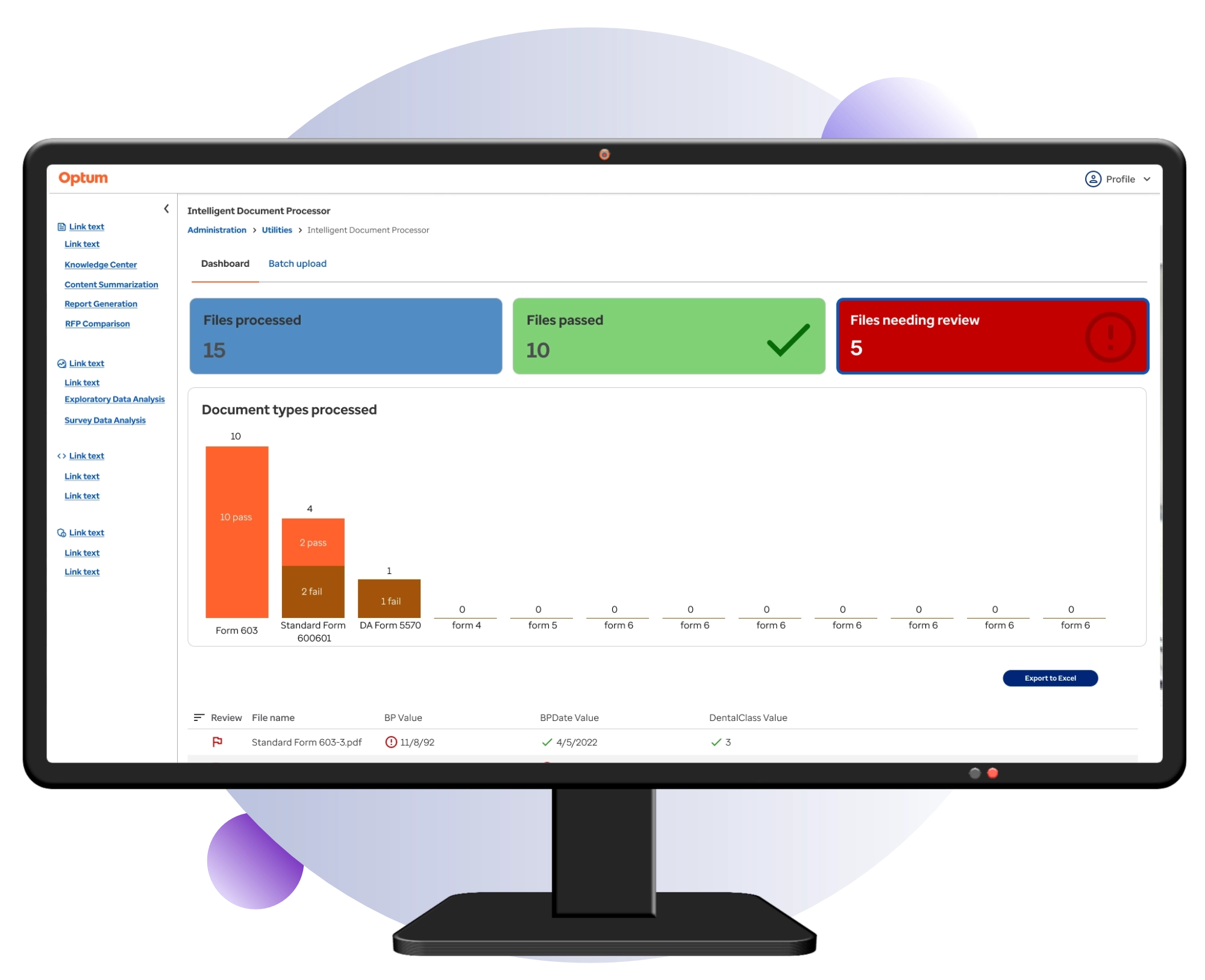
a preview image of the Optum RHRP application. It shows the browser application on a monitor

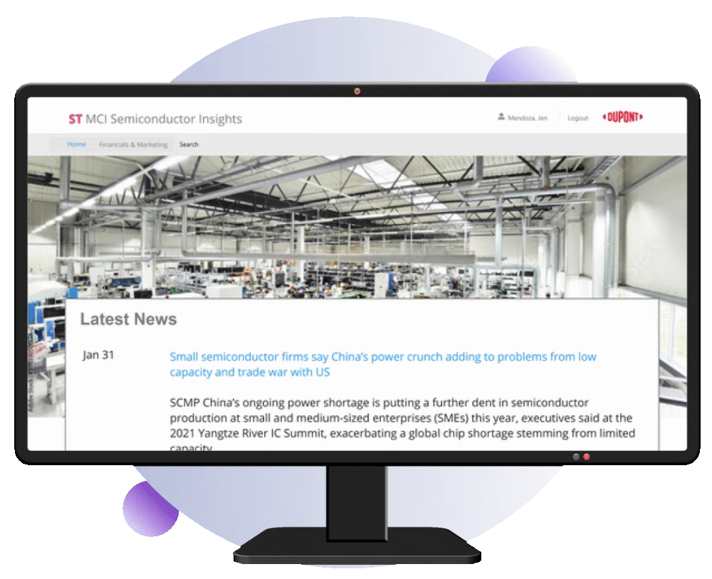
DuPont - MCI Semiconductor Insights

Helping semiconductor analysts spot production issues 33% faster through data visualization

The DuPont MCI Semiconductor Insights web application was created due to the difficulty that their semiconductor group had with gathering data needed to make integral business decisions. This application scraped data from the web and allowed users to manually upload data, at which point the system would generate data visualizations in the dashboard system for the end users. This allowed the analysts to make more informed choices more quickly.

Same problem, different domain: enterprise analytics where analysts need to spot issues and opportunities before costly delays pile up.

View Case Study

How I approach data visualization design

Start with the decision, not the data.

The question is not 'what chart should we show?' The question is 'what decision does this user need to make, and what is the minimum information required to make it?' At Optum, analysts needed to know which document extractions to trust. At DuPont, analysts needed to spot production issues before costs piled up. Every visualization decision started there.

Progressive disclosure beats data dumps.

Showing everything at once creates cognitive overload. The hover mini-table at Optum replaced a full-table view that was clunky and screen-consuming. The slide-out citation panel at Optum made hundreds of pages navigable by highlighting only the cited passages. Show essential information first. Details on demand.

Make uncertainty legible.

In AI and data-heavy systems, the data is rarely clean and the output is rarely certain. Confidence scores, adapter-level attribution, and flagging systems are how you help users know when to trust the output and when to override it. This is the difference between a dashboard that gets used and one that gets ignored.

Pressure-test the visualization before it ships.

Data visualizations fail in edge cases. Unusual values. Missing data. Unexpected distributions. I used Microsoft Copilot to audit dashboard designs for edge cases I might have missed. The best way to catch blind spots is to actively look for them.

Design the system, not just the chart.

A single dashboard is not a design solution. It is a component of a larger system. Design tokens, chart libraries, and reusable data display patterns make the next dashboard faster to build and more consistent. At Optum, extending the Harmony design system with AI-specific data components made every subsequent AI feature faster to ship.

This is the same problem I solve across federal, analytics, and enterprise software: data-heavy systems where users need to trust the output, spot the patterns, and act on high-stakes data without sacrificing accuracy.